


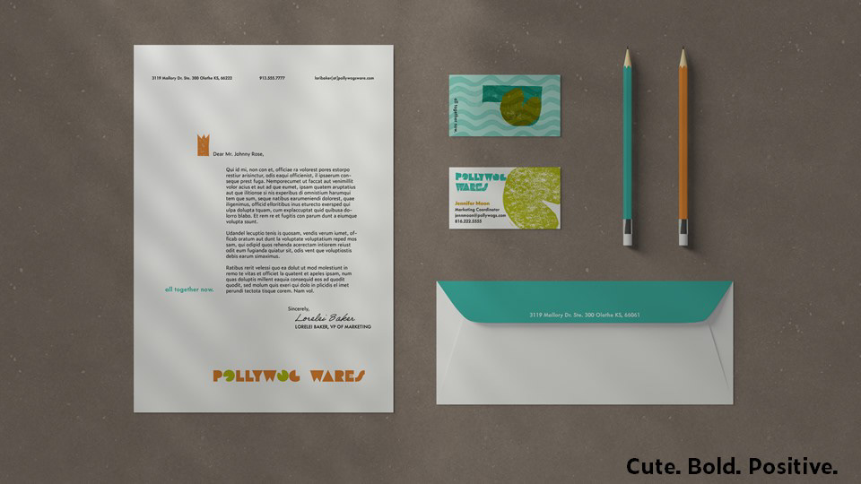
Letterhead stationery includes the crown (by the salutation) and the tagline to roughly show where to fold the letter into thirds.

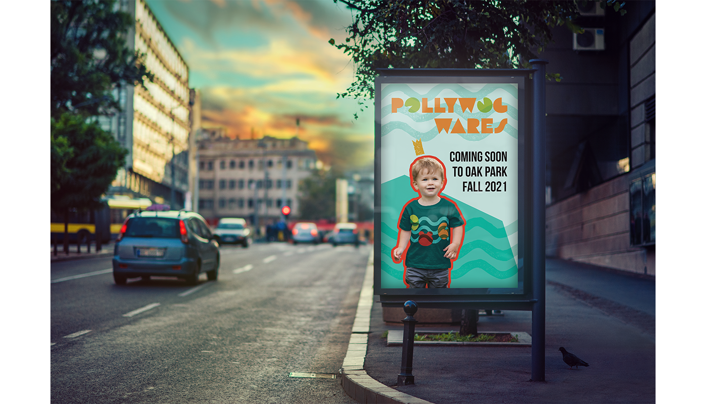
Print ad is aimed to elicit a feeling more than it is to advertise the product.
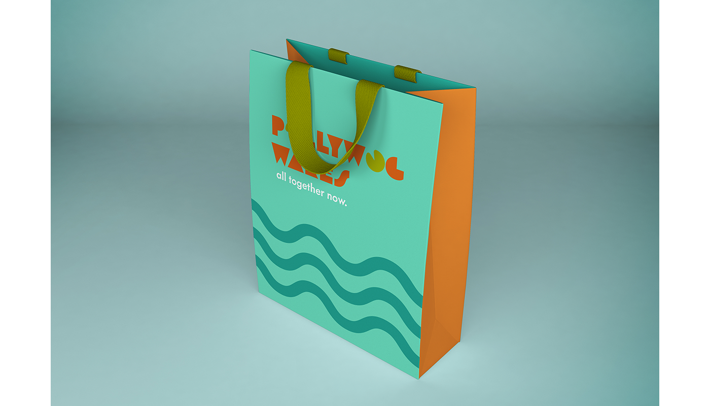
There is a sense of joy and celebration here — crucial elements of the Pollywog Wares brand.
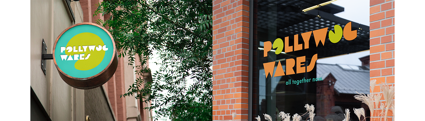
The call out sign has the logo in white over darker colors in order to stand out to far-off pedestrians,
while the storefront sign is more colorful 'and enticing for those that are nearby.


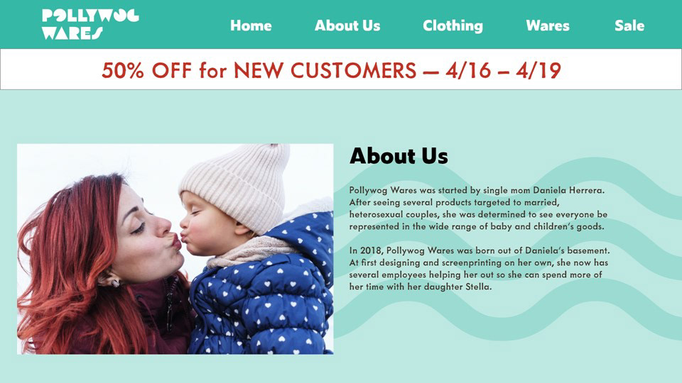

The print catalog features families that represent one of the core target audiences for Pollywog Wares.
Pollywog Wares aims to shed the visibility of these families in order to normalize and empower them.